Branding Packaging
Shaping The Landscape Of Superfood Botanicals
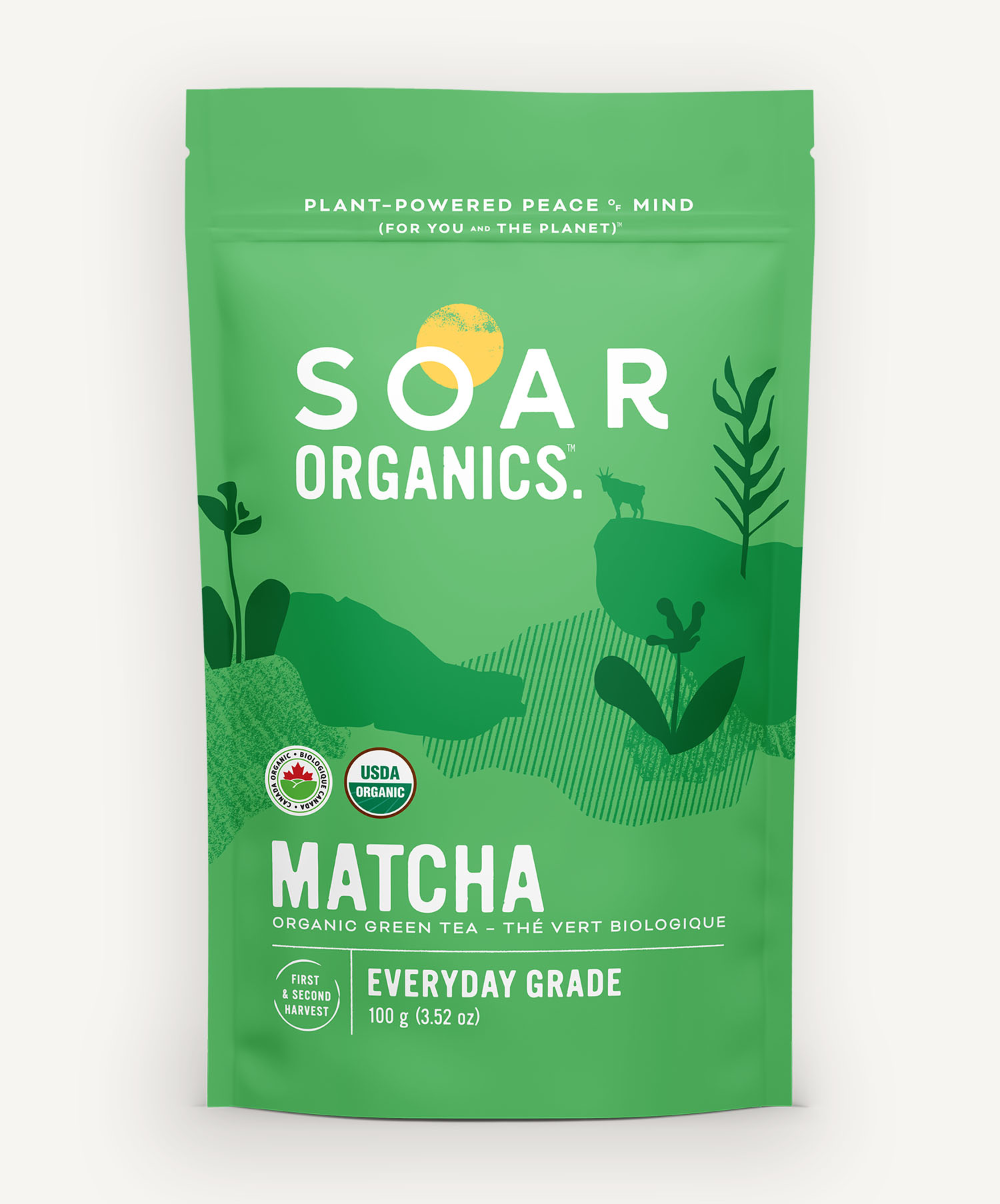
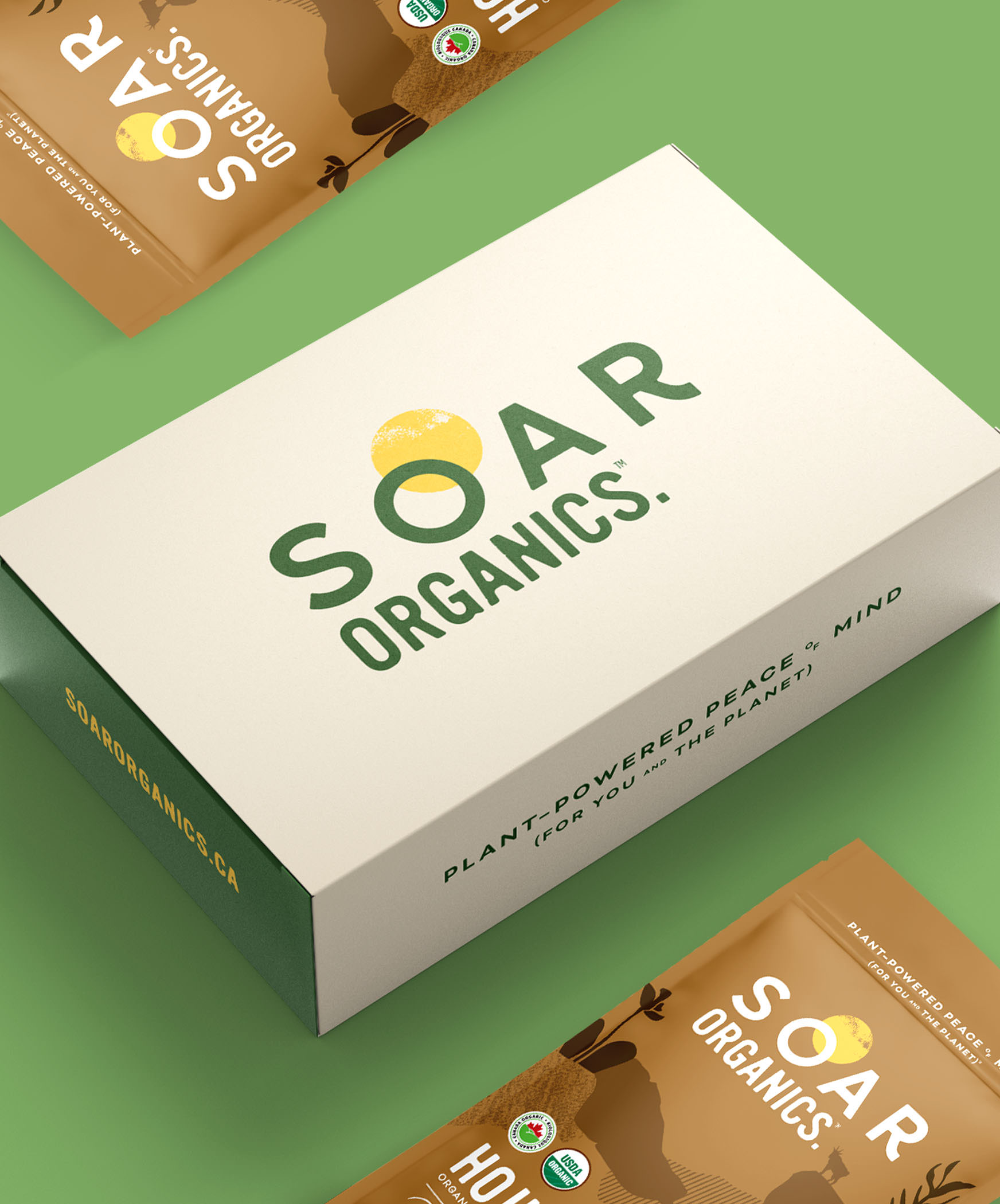
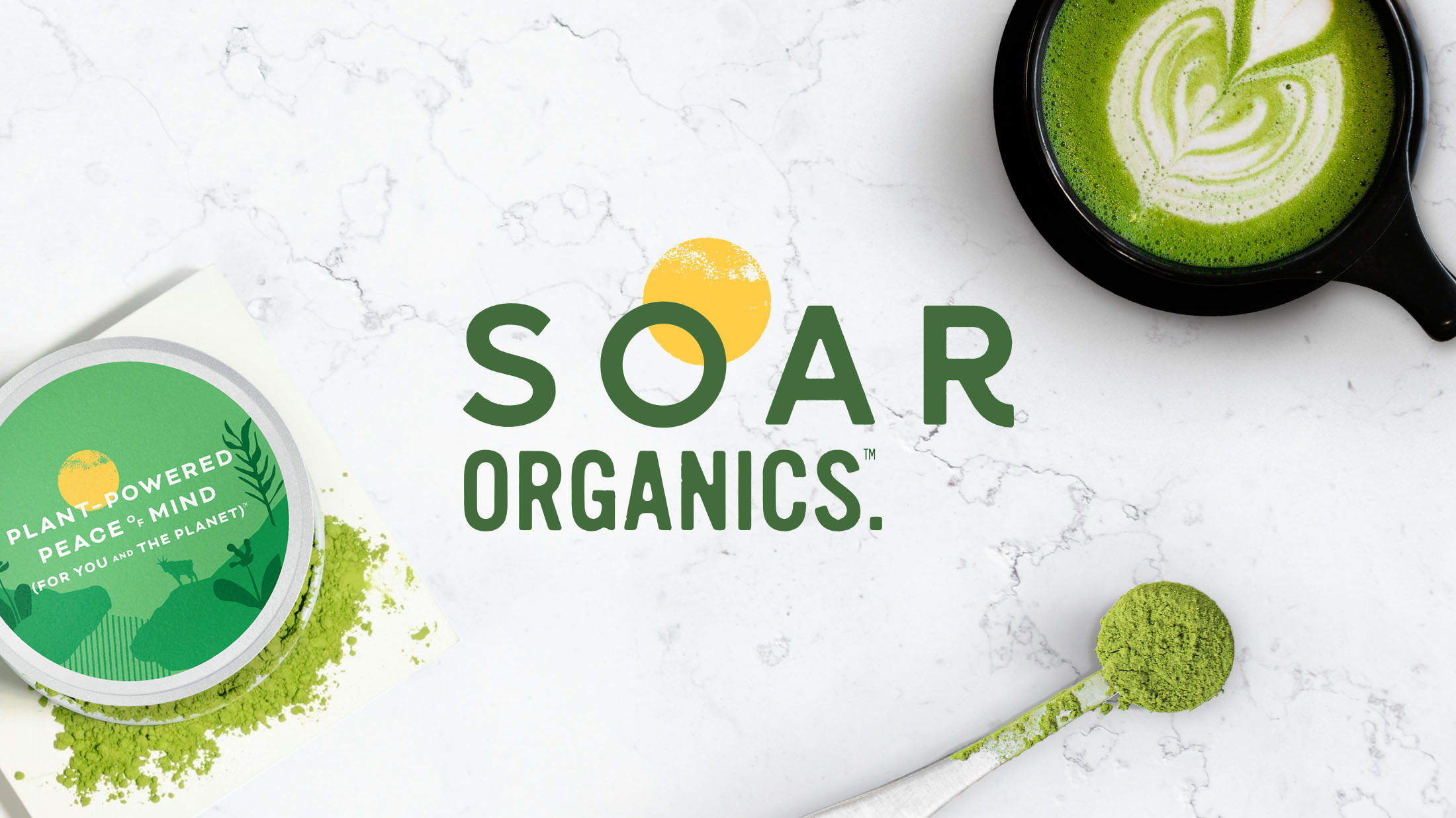
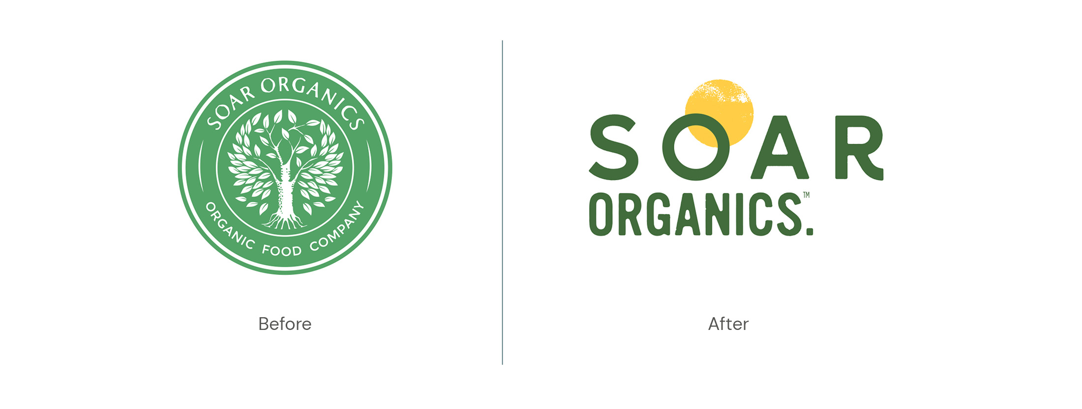
Soar Organics is a maker of top tier botanical superfoods with a focus on premium matcha. Soar’s brand evolution emphasized their dedication to sourcing ingredients from peak growing regions while keeping their commitment to social and environmental responsibility at its core.
Brand Analysis
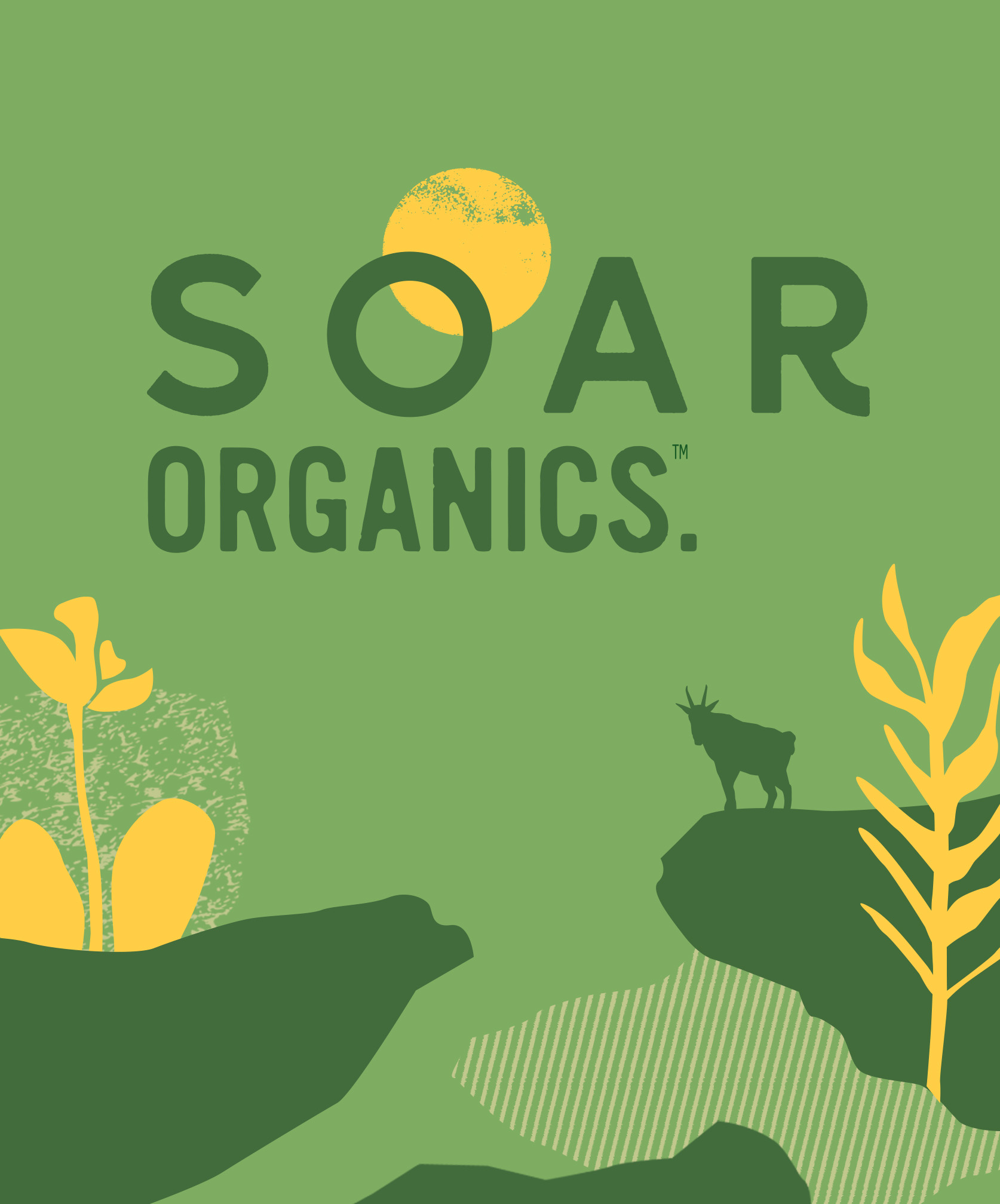
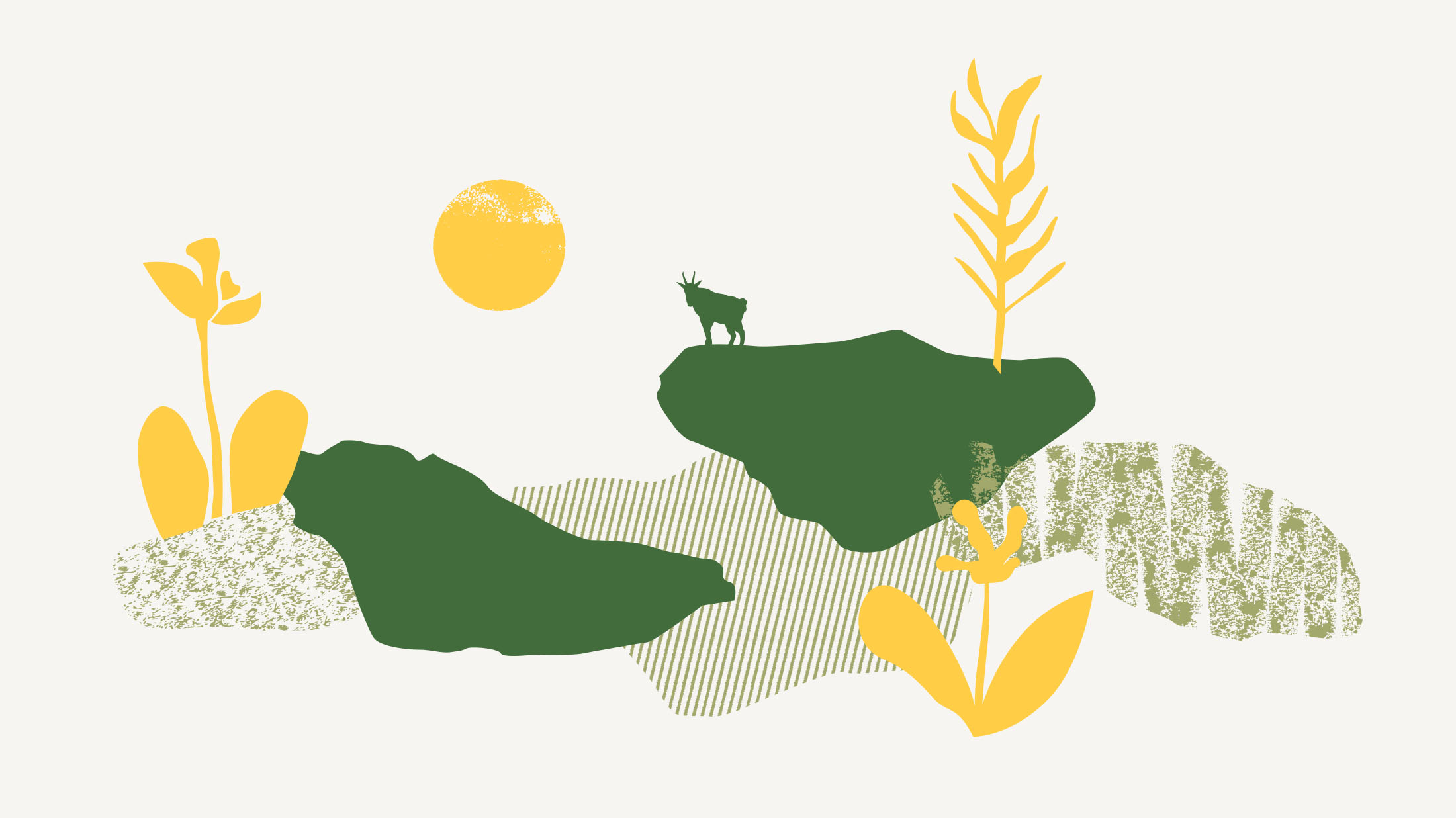
A Brand That Soars Above
- Abstract landscapes and textural layers combined with friendly typography to reflect Soar’s tireless pursuit to scour the globe for high quality growers, sharing those ingredients with their customers.
- Brand elements arrange themselves around the stylized sun, infusing Soar’s sense of optimism and vitality throughout.
- A small mountain goat acts as a mascot, paying homage to Soar’s home base in British Columbia, adding a touch of authenticity and local charm.
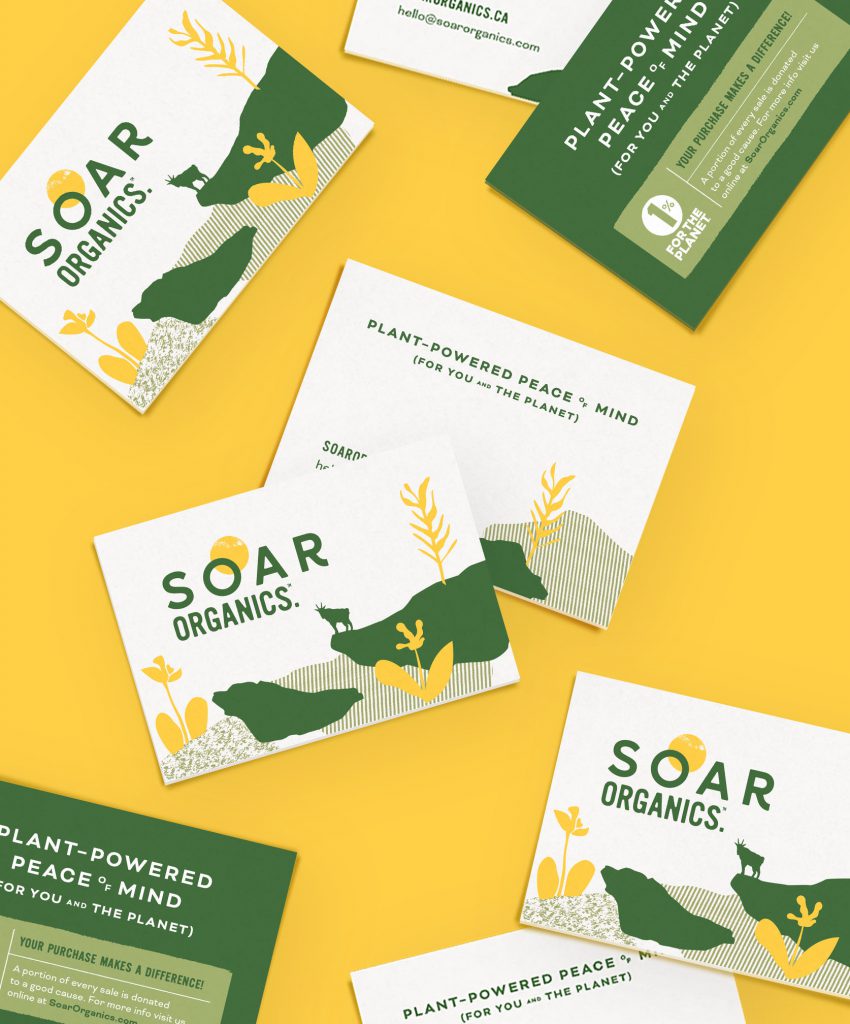
Packaging Design
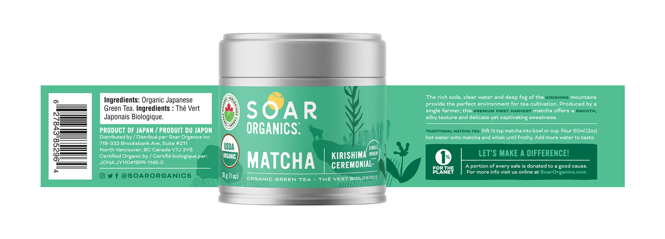
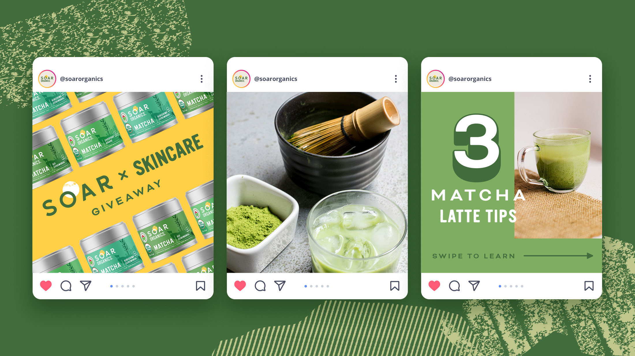
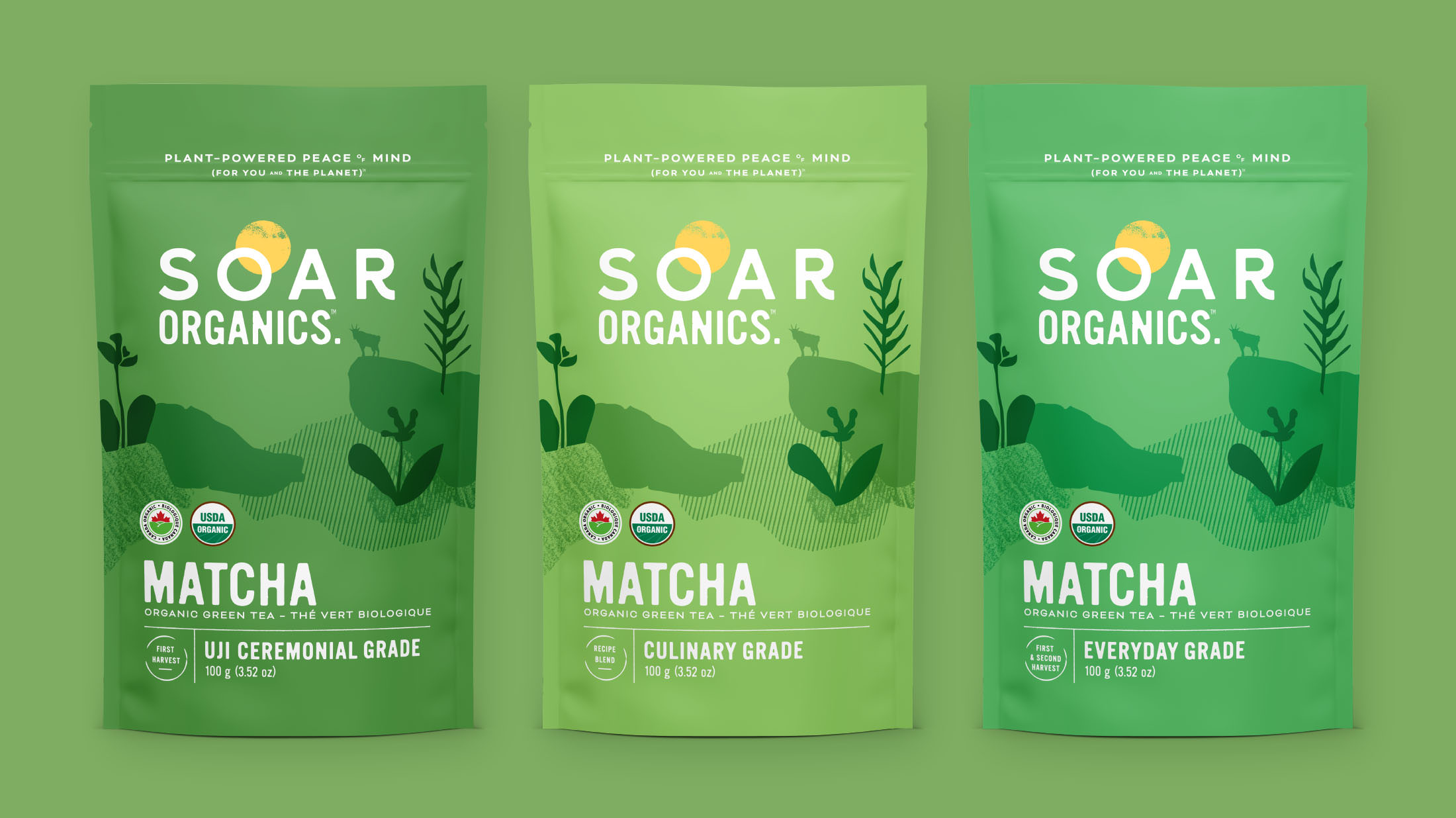
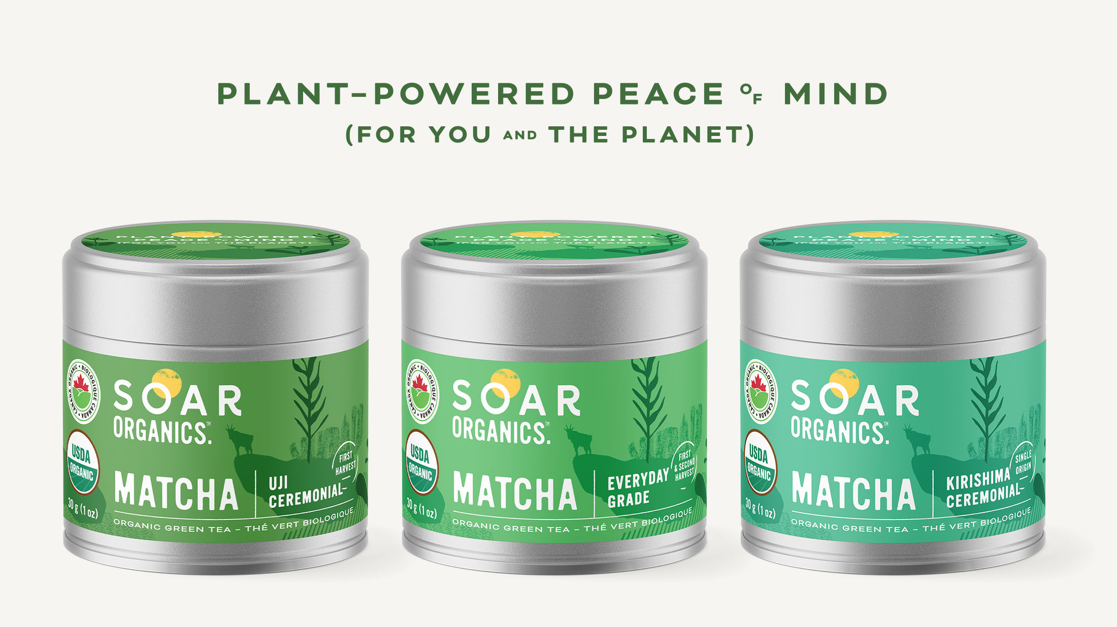
Clarifying Matcha Packaging
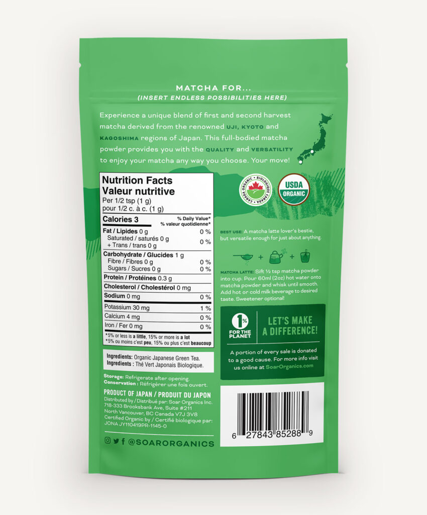
- Showcases certifications, differentiates between matcha grades, and provides detailed information on the products source.
- Custom icons indicate distinct recommended usage for each grade.
- Highlights 1% For the Planet as a core tenet of Soar’s business.